Kit Digital StarkCloud
StarkCloud Co-Marketing Guidelines
At StarkCloud, we know how crucial it is to build a strong brand image that reflects our values of innovation, scalability, and automation. Our commitment is to deliver solutions designed to enhance your business and simplify business management.
To maintain the consistency of our brand, all branding and co-branding materials must align with our guidelines, ensuring the proper use of the logo, colors, typography and communicative tone.
Any materials that use our brand must be submitted to the StarkCloud Marketing Team for review and approval, a process that takes 3-5 business days. We recommend anticipating the shipment to ensure smooth execution.
StarkCloud Branding and Logos
Your brand should always be the visual protagonist in your marketing materials, especially when it is presented on your own channels.
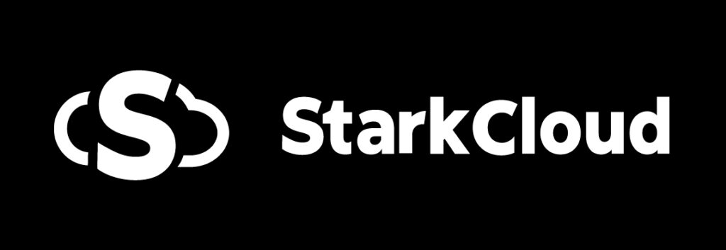
When using the StarkCloud logo:
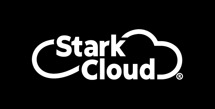
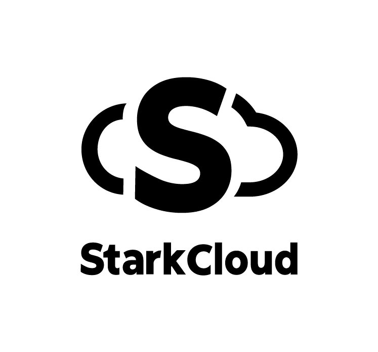
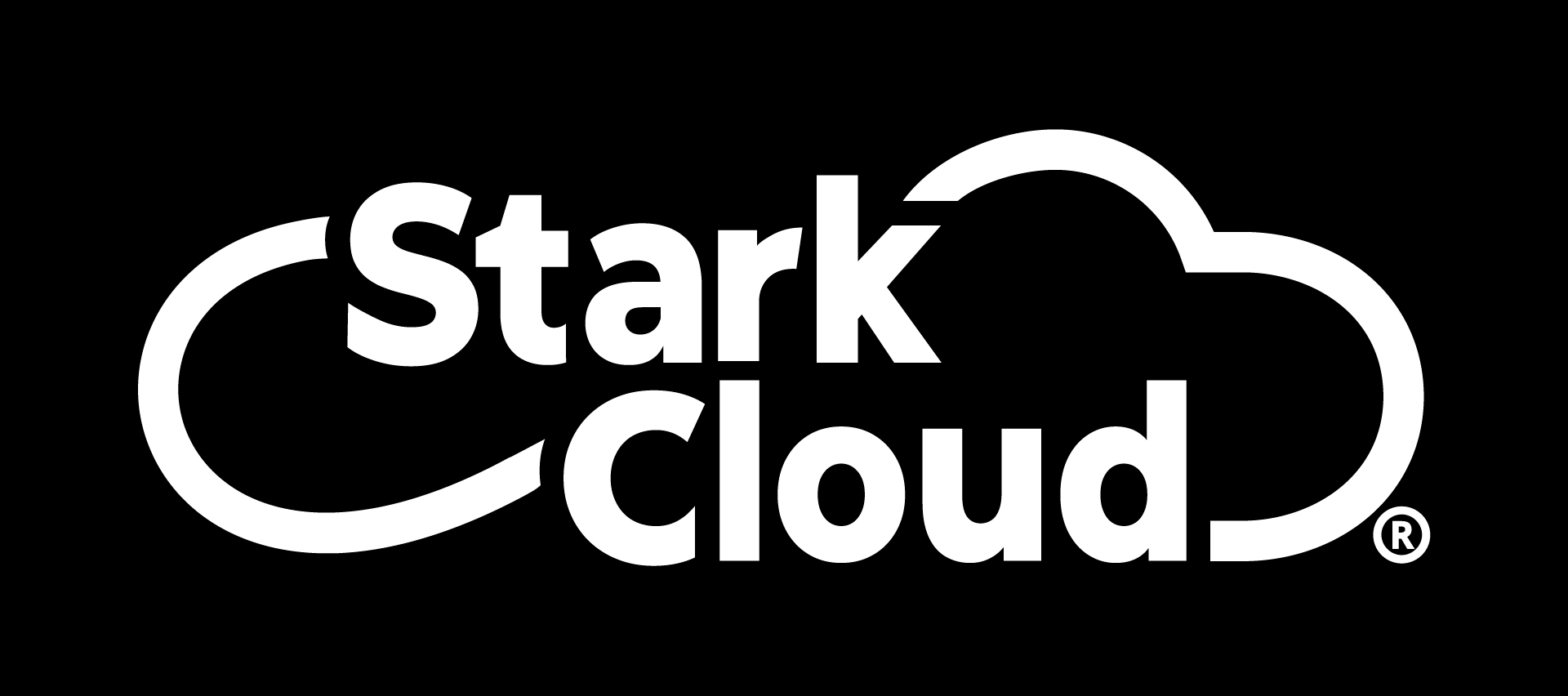
- On dark backgrounds, use the white version.
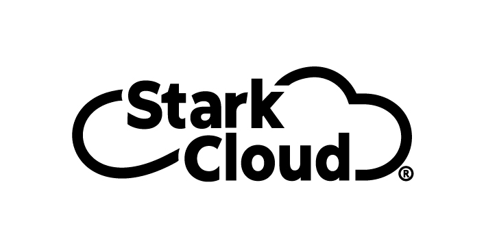
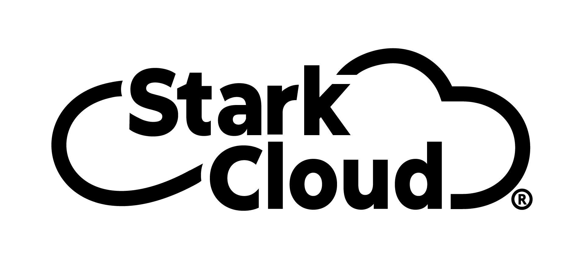
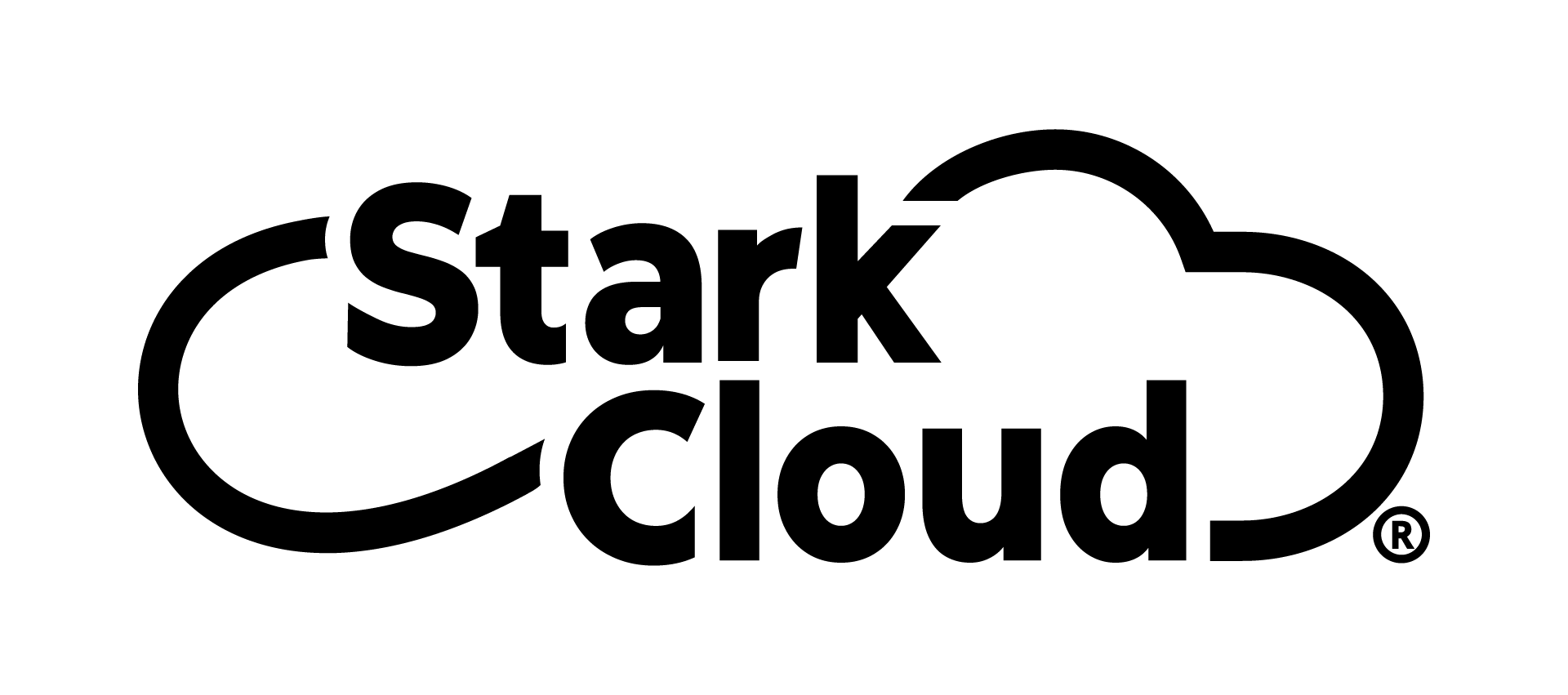
- On light backgrounds, use the full color version.
- On backgrounds that compromise readability, choose between black or white.
The color Blue or Orange can be used as a background in full-color co-marketing materials, such as logo, badges, promotional materials, gift cards, and motion graphics. Logo files are available at the links provided.
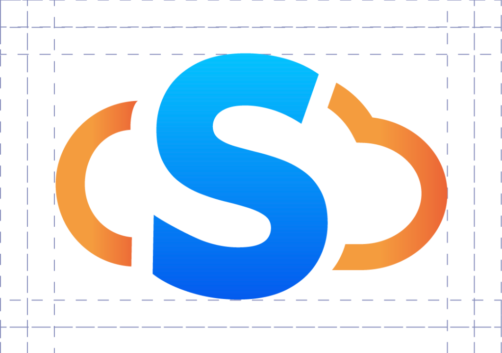
The Logo
The Isologo is our most recognizable element globally. We designed three versions to adapt to different formats:
- Use the vertical (stacked) logo for vertical or square compositions.
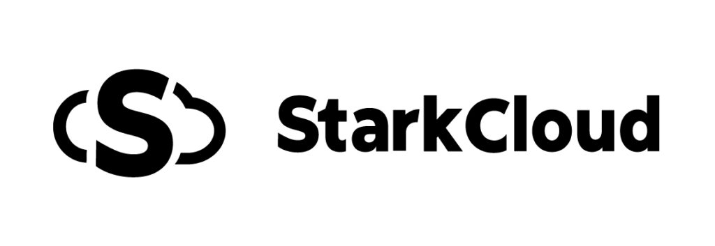
- Use the horizontal logo for horizontal or landscape compositions.
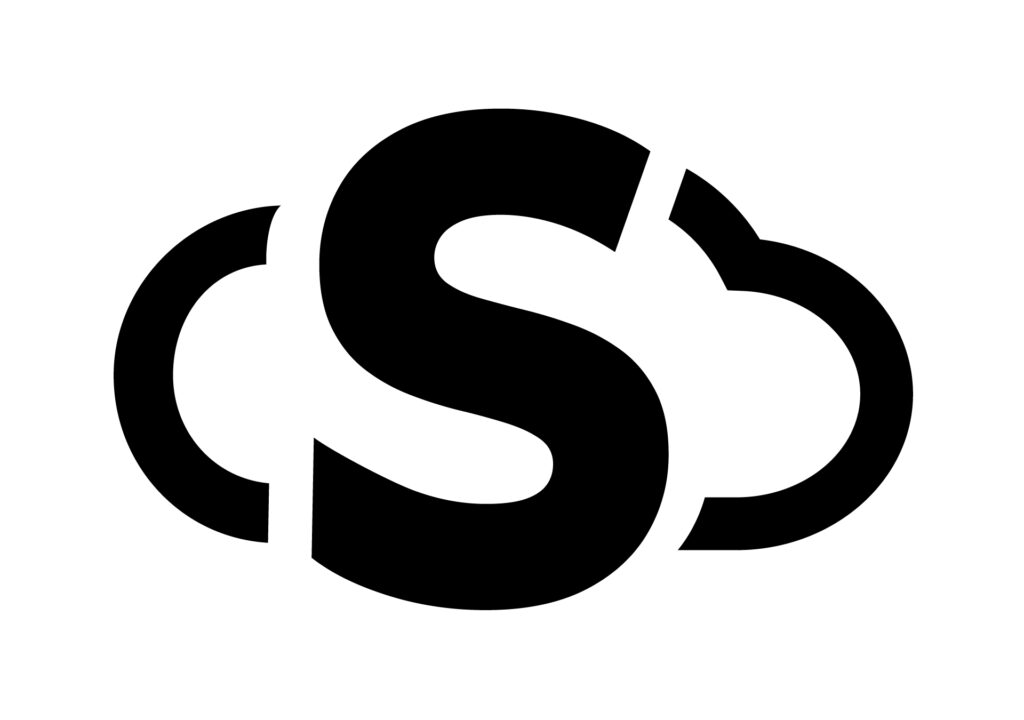
- Use the Isotype, when redundant the word “StarkCloud”.
- It should be noted that it can be discerned in the use of each one, always ensuring the best visibility for the brand.
Our preference is the vertical Isologo, as it reflects the foundations of StarkCloud’s beginnings. However, the horizontal version may be more suitable for many cases.
Using the StarkCloud App Icon in Digital Runs
StarkCloud Fundamental Colors
StarkCloud’s core colors—blue, orange, and white—form the foundation of our visual identity. These colors reflect the innovation, technology, and trust that our brand represents.
Using the Main Colors
- White (#FAFAFA): Used as the main background to ensure a clean and professional appearance.
- Light Blue (#00A1FF) and Deep Blue (#005EF): They represent technology and reliability. They are used in the logo, digital materials, and key visual elements.
- Orange (#F59D2E) and Dark Orange (#E36A35): They reflect energy and innovation. Applicable in visual emphasis elements, calls to action, and supporting graphics.
Recommended Applications
- The use of blue as the main color should predominate in the elements, while orange can be used as a visual accent.
- The blue-orange gradient can be applied on backgrounds or dynamic graphics to give a modern look to the brand.
StarkCloud Logo Security Space
To ensure that the StarkCloud logo retains its visual impact and clarity, it is essential to maintain adequate clearance around it.
Spacing Rule
The minimum safety space around the logo must be equal to or greater than the width of the letter “r” in the word “Stark” within the logo. This helps prevent elements such as images, text, or other graphics from compromising the visual integrity of the logo.
This rule applies to all versions of the logo, including badges and branding variations used in different formats.
Additional Considerations
- Make sure there are no intrusive visuals within this space to maintain a clean and professional appearance.
- In digital and print applications, it adheres to these ratios to ensure readability at all sizes and resolutions.
- When the logo is used in co-marketing materials, make sure that other branding elements respect the set free space.
Minimum size
Print: 4 cm wide
Web: 80 px wide
Minimum size
Print: 2 cm wide
Web: 32 px wide
Minimum size
Print: 4 cm wide
Web: 100 px wide
Minimum size
Print: 2 cm wide
Web: 32 px wide
Partner logos
When collaborating with our partners through the joint presentation of logos, from our brand, our logo must be the visual protagonist of the brand, always being first.
Proper Use Guidelines
- Positioning
- Our logo should appear first and take the visual spotlight.
- The StarkCloud logo should be placed on the left as a recognizable element to read in the first instance.
- Spacing
- There should be a clear visual space between logos to avoid overlap and ensure clarity.
- It is recommended to use a thin dividing line to separate both marks without compromising their visibility.
- Relative Sizes
- Make sure that the size of our partner’s logo is the same as StarkCloud’s to reinforce the presence of both brands.
- Do not shrink the StarkCloud logo to a size where readability is affected.
- Logo Versions
- You can choose from different variants of the StarkCloud logo (horizontal, icon, or stacked) depending on the available space and visual design.
- Use the appropriate color version to ensure contrast with the background.
- Background and Contrast
- Use a light or neutral background that ensures the visibility of both logos.
- Avoid backgrounds with complex patterns that can be distracting or difficult to read the logos.
By following these guidelines, you can ensure that your brand presence remains aligned with StarkCloud’s standards, maximizing your business’s impact on co-marketing campaigns.
As an element of external co-marketing
An effective way to promote marketing opportunities in collaboration with your business and StarkCloud is by co-presenting logos. To maintain proper visual hierarchy and a consistent brand presence, follow these guidelines when using the logo block:
Proper Use Guidelines
- Positioning
- Your company logo should always appear first and take center stage.
- The StarkCloud logo should be placed on the right as a supporting element, ensuring balance and coherence.
- Follow previous proposed guidelines.
By following these guidelines, you can ensure that your brand presence remains aligned with StarkCloud’s standards, maximizing your business’s impact on co-marketing campaigns.
Misuse of the StarkCloud Logo
To keep StarkCloud’s visual identity consistent and professional, it is important to avoid certain misuses of the logo. Below are examples of what not to do with our logo
Description of Visual Composition for StarkCloud
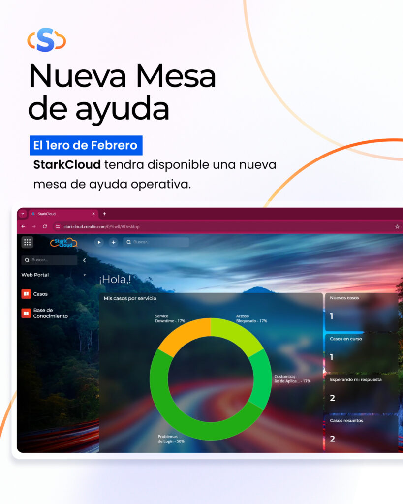
StarkCloud’s visual pieces follow a clean and professional design, highlighting the corporate colors blue and orange in combination with light backgrounds to maintain a modern and elegant appearance.
Key Design Features:
Use of Corporate Colors:
- Predominance of gradients in blue and orange tones that reflect innovation and confidence.
- White backgrounds with subtle details in brand colors to highlight key elements.
Balanced Composition:
- Harmonious distribution of images and text, using strategic white space for clear reading.
- Curved visuals that reinforce StarkCloud’s dynamic identity.
Clear and Professional Typography:
- Use of modern, readable fonts that emphasize the hierarchy of information.
- Key points highlighted in brand colors to capture the viewer’s attention.
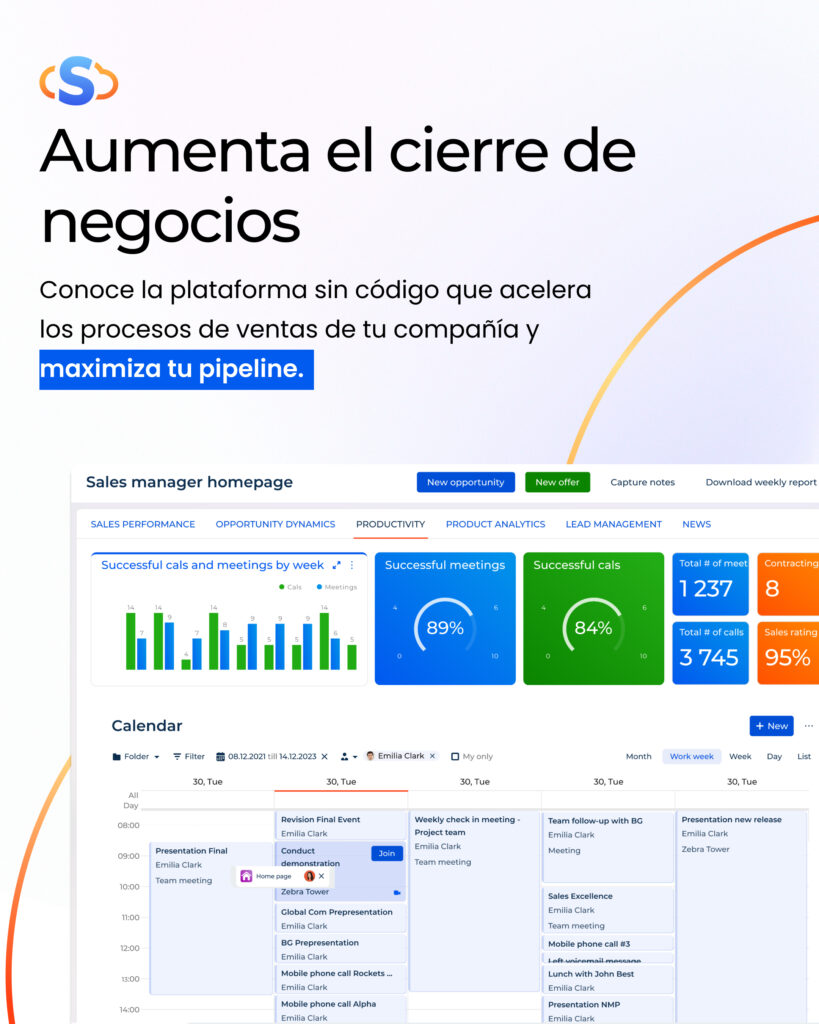
High Quality Product Images:
- Screenshots of the StarkCloud platform, integrated in an attractive and functional way.
- Visual elements such as graphs and dashboards that reinforce the value proposition.
These guidelines ensure that StarkCloud’s visual presence is consistent, engaging, and effective in your marketing and communication campaigns.
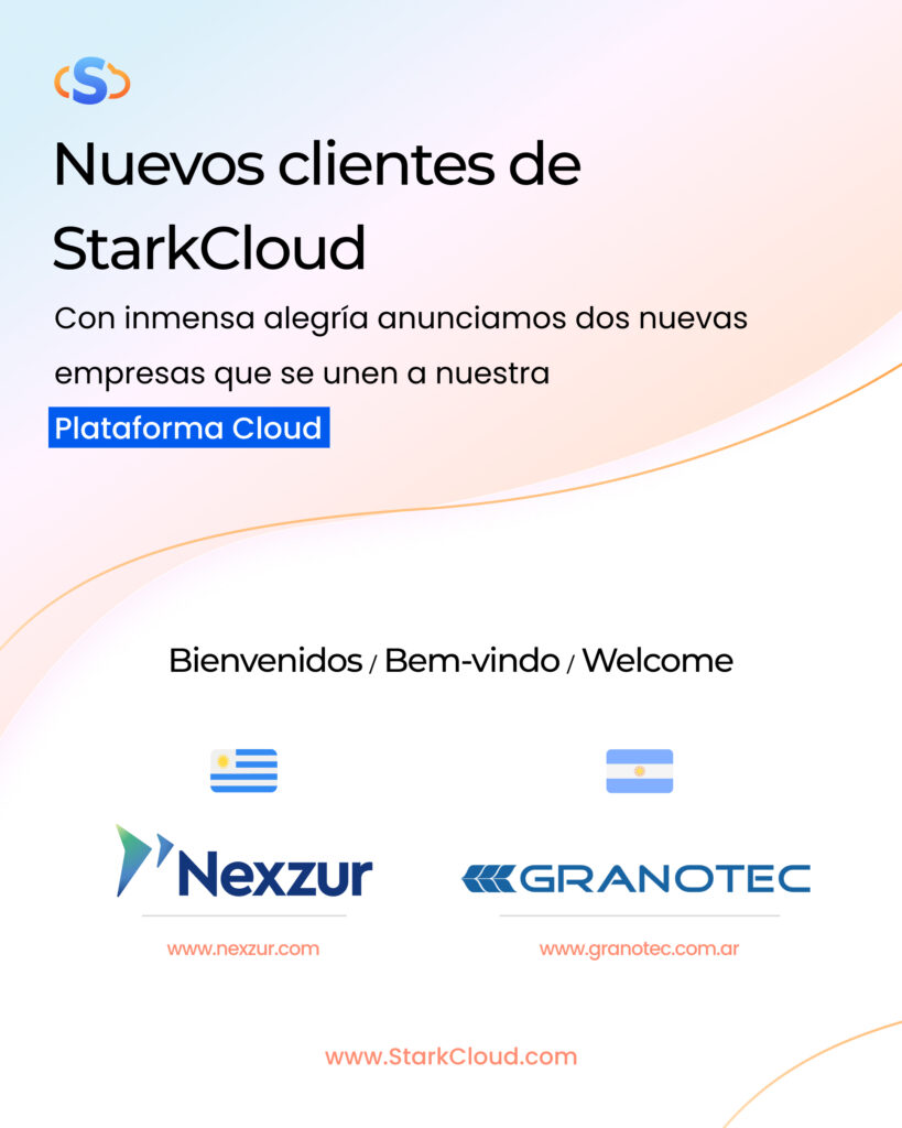
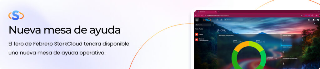
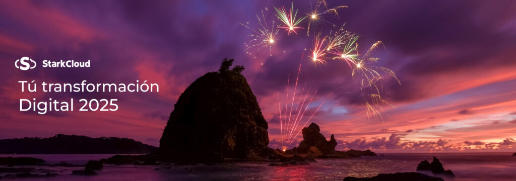
Here are some sample pieces you can use for inspiration:
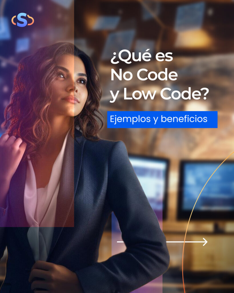
Using Social Media Photos for StarkCloud
StarkCloud’s visual approach to social media is based on a combination of high-quality photographs, corporate colors, and strategic graphic elements that communicate professionalism, innovation, and closeness.
Image Use Strategy:
Careful Image Selection
- Photographs are used that reflect technology, collaboration and business success.
- Images of people convey trust and empathy, while interface and tool graphics highlight the platform’s capabilities.
- Scenarios related to work environments, digital transformation and cloud solutions are prioritized.
Structured Visual Composition
- Elements of the visual identity, such as StarkCloud’s gradient and curved lines, are integrated to generate a dynamic design.
- The images are combined with neutral or out-of-focus backgrounds to emphasize key messages.
- A visual balance is maintained between image and text, ensuring that both elements are easily readable.
Use of Logo and Brand Elements
- The StarkCloud logo is always located on the top left or right, ensuring visibility without interfering with the main image.
- Corporate colors (blue and orange) are used to highlight titles, calls to action, and important keywords.
Clear and Attractive Typography
- Images often include short, direct messages in modern, high-contrast fonts.
- Bold color text highlights are applied to highlight key information such as dates, benefits, and recommended actions.
Visual Consistency in the Feed
- A uniform aesthetic is maintained across all posts to ensure visual consistency across the social media profile.
- The images follow a consistent color palette that reinforces brand recognition.
- The use of gradients and transparencies adds depth and modernity to the design.
Effective Calls to Action
- Visual buttons or subtle arrows are included to invite interaction (visit the website, learn more, etc.).
- Persuasive language aligned with the image is used to encourage conversion.
Typography in StarkCloud's Visual Style
The use of appropriate fonts is essential to maintain StarkCloud’s consistent and professional visual identity. Our selection of fonts reflects modernity, accessibility, and clarity in communication.
Main Typefaces
Montserrat – Titles and Headings
Used to highlight key messages, main headlines, and important headlines in graphic and digital materials.
Its geometric and elegant style conveys innovation and solidity.
Download Montserrat in Google Fonts
Poppins – Body Texts
Ideal for paragraphs, descriptions, and explanatory content due to its readability and clean style.
Its versatile design allows for comfortable reading in both digital and print media.
Download Poppins in Google Fonts
Usage Guidelines
Typographic Hierarchy:
Use Montserrat for main titles with a medium or bold weight, while Poppins should be used in secondary texts with a regular or light weight.
Spacing and Size:
Maintain proper line spacing to improve readability, and use proportional font sizes depending on the publishing medium.
Color Combination:
Apply the fonts in combination with StarkCloud’s official color palette, using appropriate contrasts to ensure good visibility.
By following these guidelines, we ensure that StarkCloud’s visual communication is consistent, modern, and accessible to our audience.
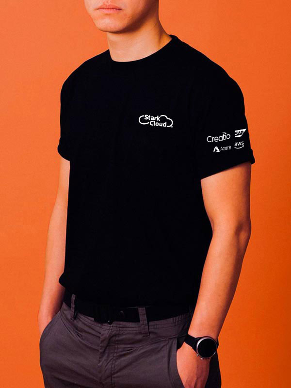
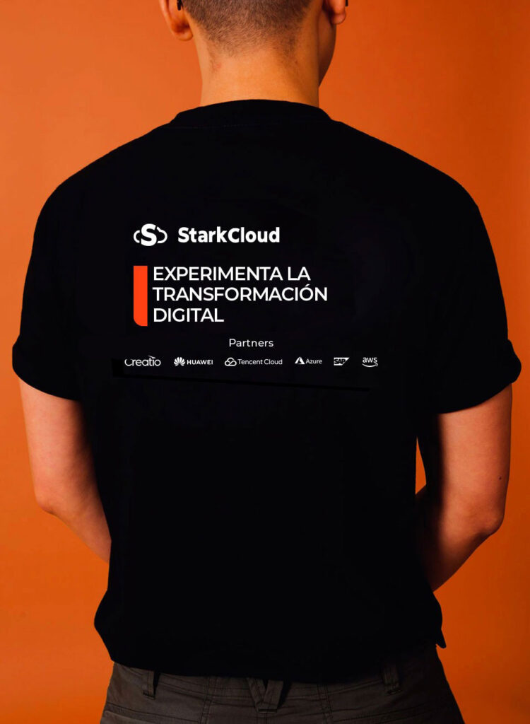
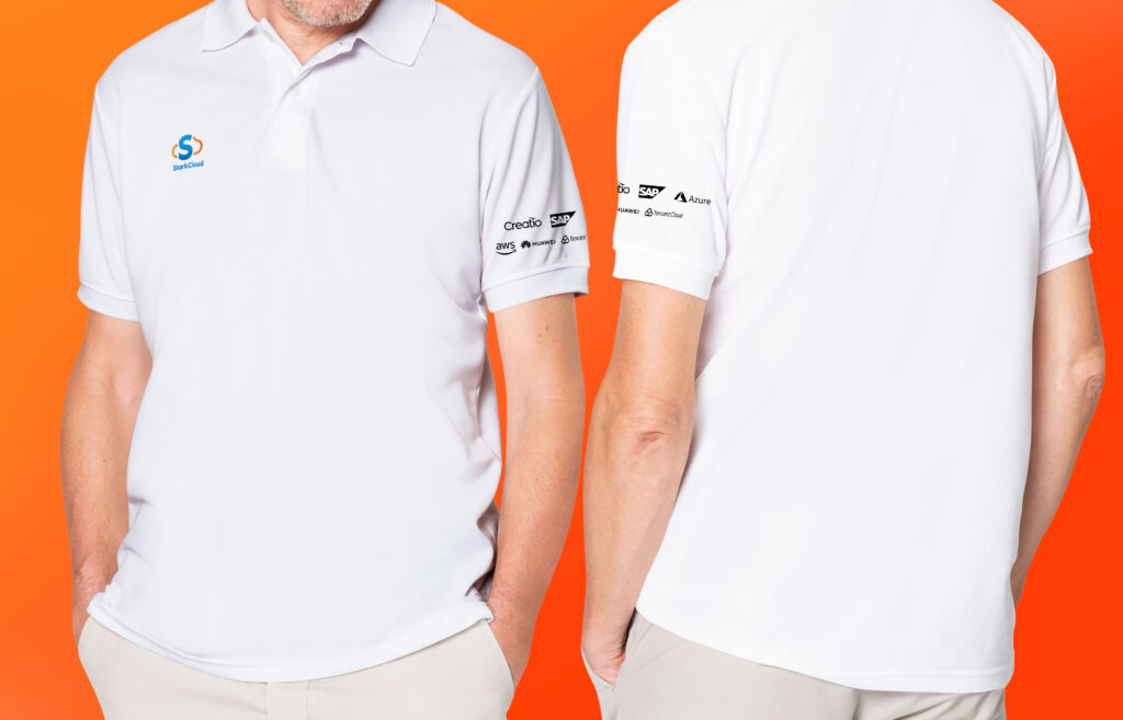
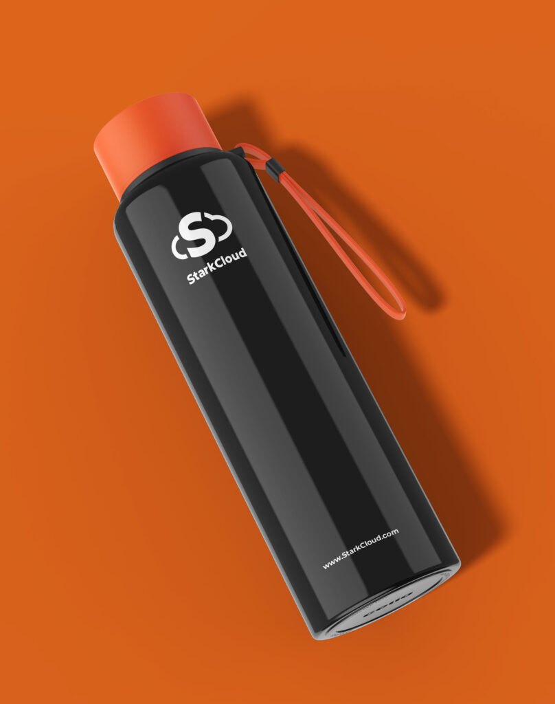
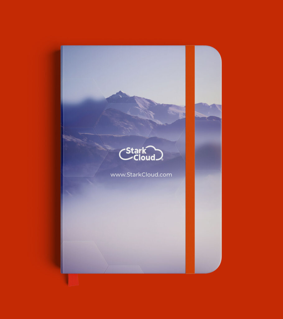
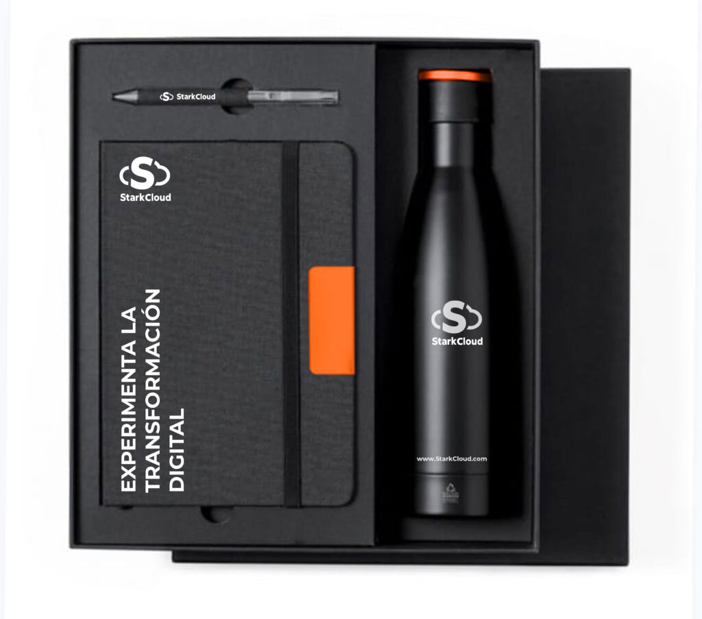
StarkCloud Branding Management
At StarkCloud, branding is not just a visual identity, but an extension of our values and vision. Every element, from corporate apparel to promotional products, has been carefully designed to communicate confidence, innovation and professionalism.
How we apply our visual identity:
Consistency across all touchpoints:
- We apply our corporate colors uniformly on garments, accessories, and printed materials, ensuring that each piece reflects the essence of StarkCloud.
- The logo is strategically positioned to maximize its visibility without cluttering the design.
High-quality material selection:
- All items, from t-shirts to promotional bottles, are carefully selected to convey durability and excellence, values that define our brand.
Color Palette Application:
- We use our palette of gradients and solid tones precisely, ensuring that each combination resonates with the modernity and dynamism of the company.
Elegant and functional typography:
- The combination of Montserrat for titles and Poppins for texts ensures clear and effective communication, both on digital and physical media.
Flexibility in customization:
- We adapt our brand to different formats and contexts without losing its essence, from corporate events to social media campaigns.
With this brand manual we have defined the visual bases that will guide all StarkCloud expressions. Thank you for being a part of our visual history and making sure that every branded app reflects the innovation and quality that we are known for.
Let’s continue to transform the digital future together!


